![]()
This is the print version of this page. All content is copyright Indezine.com 2000-2026.
![]()
Definitions and resources for terms and techniques used in the world of presentations
See Also:
PowerPoint and Presenting Notes
PowerPoint and Presenting Glossary
Presentations Glossary in alphabetical order:
A |
B |
C |
D |
E |
F |
G |
H |
I |
J |
K |
L |
M |
N |
O |
P |
Q |
R |
S |
T |
U |
V |
W |
X |
Y |
Z
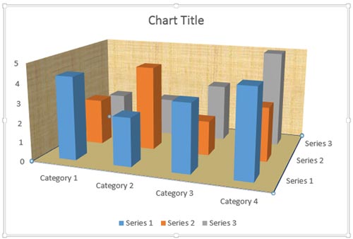
Let’s imagine your slide background is filled with some picture or texture. This may cause your chart columns to appear merged with the background. In such a situation, you can make your chart columns prominent by formatting the walls and floor of your 3D chart.
To learn more, choose your version of PowerPoint. If we do not have a tutorial for your version of PowerPoint, explore the version closest to the one you use.
Format Walls and Floor of 3D Charts in PowerPoint 2013
Format Walls and Floor of 3D Charts in PowerPoint 2011
Tutorial Code: 10 11 04
Previous: 10 11 03 Rotate 3D Charts in PowerPoint
Next: 10 12 01 Adjust the Chart Gap Width in PowerPoint
Filed Under:
Number
Tagged as: 10-11, 3D Charts, Charts and Graphs, PowerPoint Tutorials
Comments Off on 3D Charts: Format Walls and Floor of 3D Charts in PowerPoint
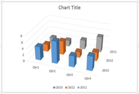
When your 3D chart comprises columns of various heights, chances are that some of the columns hide other columns placed behind them. To overcome this problem you can rotate the 3D chart so that you end up with a view in which the shorter columns become clearly visible.
To learn more, choose your version of PowerPoint. If we do not have a tutorial for your version of PowerPoint, explore the version closest to the one you use.
Rotate 3D Charts in PowerPoint 2013
Rotate 3D Charts in PowerPoint 2011
Tutorial Code: 10 11 03
Previous: 10 11 02 Make 3D Columns Semi-Transparent for Charts in PowerPoint
Next: 10 11 04 Format Walls and Floor of 3D Charts in PowerPoint
Filed Under:
Number
Tagged as: 10-11, 3D Charts, Charts and Graphs, PowerPoint Tutorials
Comments Off on 3D Charts: Rotate 3D Charts in PowerPoint
It’s good to avoid using 3D charts unless your chart data requires a Z-axis. Having said that, we have chosen the topic of making your 3D columns in a chart transparent. Yes, there’s a reason to do so especially when you find that some of the columns in your 3D chart may be hiding behind one or more of the other columns, just because they are not tall enough.
To learn more, choose your version of PowerPoint. If we do not have a tutorial for your version of PowerPoint, explore the version closest to the one you use.
Make 3D Columns Semi-Transparent for Charts in PowerPoint 2013
Make 3D Columns Semi-Transparent for Charts in PowerPoint 2011

Tutorial Code: 10 11 02
Previous: 10 11 01 Z Axis in PowerPoint Charts: Pros and Cons
Next: 10 11 03 Rotate 3D Charts in PowerPoint
Filed Under:
Number
Tagged as: 10-11, Chart Legend, Charts and Graphs, PowerPoint Tutorials
Comments Off on 3D Charts: Make 3D Columns Semi-Transparent for Charts in PowerPoint
Tick marks in charts are indications placed on the axis that help you get a better idea about chart values. Major tick marks are indications on an axis that show up between categories on the categories axis, and besides major unit values on the value axis. Minor tick marks are those tick marks that appear between major tick marks on an axis.
To learn more, choose your version of PowerPoint. If we do not have a tutorial for your version of PowerPoint, explore the version closest to the one you use.
Tick Marks on Chart Axes in PowerPoint 2013
Tick Marks on Chart Axes in PowerPoint 2010
Tick Marks on Chart Axes in PowerPoint 2011
Tutorial Code: 10 08 04
Previous: 10 08 03 Set Minimum and Maximum Values on Value Axis in PowerPoint
Next: 10 08 05 Change Major and Minor Units of Value Axis in PowerPoint
Filed Under:
C
Tagged as: 10-08, Chart Axes, Charts and Graphs, PowerPoint Tutorials
Comments Off on Chart Axes: Tick Marks in PowerPoint
Do you like the default locations where PowerPoint places your axes’ labels? Yes, we do believe that the defaults do work best most of the time because audiences expect these labels to exist at these familiar locations. However, there may be times when you probably don’t even need labels for your axes, or you may want them placed in another location so that your charts look cleaner. Whatever your motive may be, it is indeed possible to change the position of axis labels vis-à-vis the axis.
To learn more, choose your version of PowerPoint. If we do not have a tutorial for your version of PowerPoint, explore the version closest to the one you use.
Reposition and Hide Axis Labels in PowerPoint 2013
Reposition and Hide Axis Labels in PowerPoint 2011

Tutorial Code: 10 08 07
Previous: 10 08 06 Changing Axis Labels in PowerPoint
Next: 10 08 08 Add Secondary Value Axis to Charts in PowerPoint
Filed Under:
C
Tagged as: 10-08, Chart Axes, Charts and Graphs, PowerPoint Tutorials
Microsoft and the Office logo are trademarks or registered trademarks of Microsoft Corporation in the United States and/or other countries.