![]()
This is the print version of this page. All content is copyright Indezine.com 2000-2026.
![]()
Definitions and resources for terms and techniques used in the world of presentations
See Also:
PowerPoint and Presenting Notes
PowerPoint and Presenting Glossary
Presentations Glossary in alphabetical order:
A |
B |
C |
D |
E |
F |
G |
H |
I |
J |
K |
L |
M |
N |
O |
P |
Q |
R |
S |
T |
U |
V |
W |
X |
Y |
Z

Mark Schwartz is the executive vice president for sales and marketing at Articulate. In this role, he has worldwide sales responsibility for Articulate leading the direct sales and channel management teams as well as all product marketing activities. Prior to joining Articulate, Mark spent 20 years in sales and sales management roles with IBM and Dell.
Here’s a list of links on Indezine.com where he has been featured:
 Articulate Presenter ’09: Conversation with Mark Schwartz
November 4, 2008
Articulate Quizmaker ’09: Conversation with Mark Schwartz
October 15, 2008
Articulate Engage ’09: Conversation with Mark Schwartz
October 10, 2008
Filed Under:
M
Tagged as: Articulate, Mark Schwartz, Personality
Comments Off on Mark Schwartz
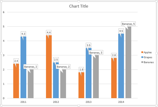
In PowerPoint, there is an option called Data Callouts that allows you to place your Data Labels within callout shapes.
To learn more, choose your version of PowerPoint. If we do not have a tutorial for your version of PowerPoint, explore the version closest to the one you use.
Change Callout Shapes for Data Labels in PowerPoint 2013

Tutorial Code: 10 06 04
Previous: 10 06 03 Callout Data Labels for Charts in PowerPoint
Next: 10 06 05 Label Options for Chart Data Labels in PowerPoint
Filed Under:
C
Tagged as: 10-06, Chart Data Labels, Charts and Graphs, PowerPoint Tutorials
Comments Off on Chart Data Labels: Change Callout Shapes for Data Labels in PowerPoint
Data Labels in PowerPoint are used to display the value, and/or the name of the Chart Series, and/or Categories right within or above the Series on the chart. In versions older than PowerPoint, Data Labels were contained within a plain text box.
To learn more, choose your version of PowerPoint. If we do not have a tutorial for your version of PowerPoint, explore the version closest to the one you use.
Callout Data Labels for Charts in PowerPoint 2013
Tutorial Code: 10 06 03
Previous: 10 06 02 Chart Data Label Format Options in PowerPoint
Next: 10 06 04 Change Callout Shapes for Data Labels in PowerPoint
Filed Under:
C
Tagged as: 10-06, Chart Data Labels, Charts and Graphs, PowerPoint Tutorials
Comments Off on Chart Data Labels: Callout Data Labels for Charts in PowerPoint
Different PowerPoint versions support a number of audio file formats. Obviously, the new PowerPoint versions support a larger number of audio file formats.
To learn more, click a link from the tutorials listed below.
PowerPoint Friendly Audio Formats

Tutorial Code: 14 01 02
Previous: 14 01 01 PowerPoint Friendly Video Formats
Next: 14 02 01 Insert Video Clips in PowerPoint
Filed Under:
P
Tagged as: 14-01, Multimedia, PowerPoint Multimedia Basics, PowerPoint Tutorials
Comments Off on PowerPoint Multimedia Basics: PowerPoint Friendly Audio Formats
Adding Data Labels is one of the ways in which you can make your charts in PowerPoint more effective, informative, and relevant for your audience. Once added, you can also further change the appearance of the Data Labels to suit your requirements.
To learn more, choose your version of PowerPoint. If we do not have a tutorial for your version of PowerPoint, explore the version closest to the one you use.
Chart Data Label Format Options in PowerPoint 2013
Chart Data Label Format Options in PowerPoint 2011

Tutorial Code: 10 06 02
Previous: 10 06 01 Chart Data Labels in PowerPoint
Next: 10 06 03 Callout Data Labels for Charts in PowerPoint
Filed Under:
C
Tagged as: 10-06, Chart Data Labels, Charts and Graphs, PowerPoint Tutorials
Comments Off on Chart Data Labels: Chart Data Label Format Options in PowerPoint
Microsoft and the Office logo are trademarks or registered trademarks of Microsoft Corporation in the United States and/or other countries.