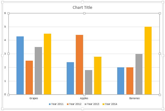
Any typical column chart contains two sets of data, one set shows as the Series within your charts, and the other set ends up representing the Categories. By default, the Series show up as the Legend (and columns) within the chart. Categories on the other hand constitute the groups of these individual columns.
To learn more, choose your version of PowerPoint. If we do not have a tutorial for your version of PowerPoint, explore the version closest to the one you use.
Microsoft Windows
Switch Series and Categories for Charts in PowerPoint 2013
Apple Mac
Switch Series and Categories for Charts in PowerPoint 2011
Tutorial Code: 10 05 07
Previous: 10 05 06 Change Order of Chart Data Series in PowerPoint
Next: 10 05 08 Creating Charts Using Existing Excel Data in PowerPoint