![]()
This is the print version of this page. All content is copyright Indezine.com 2000-2026.
![]()
Definitions and resources for terms and techniques used in the world of presentations
See Also:
PowerPoint and Presenting Notes
PowerPoint and Presenting Glossary
Presentations Glossary in alphabetical order:
A |
B |
C |
D |
E |
F |
G |
H |
I |
J |
K |
L |
M |
N |
O |
P |
Q |
R |
S |
T |
U |
V |
W |
X |
Y |
Z
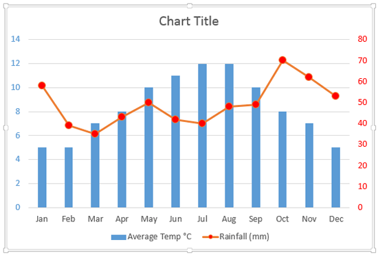
Sometimes your data type may require a second axis. The sample data that we took for this tutorial pertains to the average temperature and rainfall in London across the 12 calendar months of a year.
To learn more, choose your version of PowerPoint. If we do not have a tutorial for your version of PowerPoint, explore the version closest to the one you use.
Add Secondary Value Axis to Charts in PowerPoint 2013
Add Secondary Value Axis to Charts in PowerPoint 2011
Tutorial Code: 10 08 08
Previous: 10 08 07 Reposition and Hide Axis Labels in PowerPoint
Next: 10 08 09 Crossed Axes for Charts in PowerPoint
Filed Under:
C
Tagged as: 10-08, Chart Axes, Charts and Graphs, PowerPoint Tutorials
Comments Off on Chart Axes: Add Secondary Value Axis to Charts in PowerPoint
If your chart data values are not so much different from each other, the chart created using this data will not help your audience to differentiate the series representing those values.
To learn more, choose your version of PowerPoint. If we do not have a tutorial for your version of PowerPoint, explore the version closest to the one you use.
Set Minimum and Maximum Values on Value Axis in PowerPoint 2013
Set Minimum and Maximum Values on Value Axis in PowerPoint 2010
Set Minimum and Maximum Values on Value Axis in PowerPoint 2011

Tutorial Code: 10 08 03
Previous: 10 08 02 Axis Titles in PowerPoint
Next: 10 08 04 Tick Marks in PowerPoint
Filed Under:
C
Tagged as: 10-08, Chart Axes, Charts and Graphs, PowerPoint Tutorials
Comments Off on Chart Axes: Set Minimum and Maximum Values on Value Axis in PowerPoint
A chart title of course is something that describes your chart. And PowerPoint charts do have an option to use a placeholder to contain this chart title. However, before you go ahead and use this option, you must decide if you need this Chart Title placeholder or not.
To learn more, choose your version of PowerPoint. If we do not have a tutorial for your version of PowerPoint, explore the version closest to the one you use.
Chart Title in PowerPoint 2013
Chart Title in PowerPoint 2011

Tutorial Code: 10 07 01
Previous: 10 06 05 Label Options for Chart Data Labels in PowerPoint
Next: 10 08 01 Axis Titles in PowerPoint
Filed Under:
C
Tagged as: 10-07, Chart Title, Charts and Graphs, PowerPoint Tutorials
Comments Off on Chart Title: Chart Title in PowerPoint
Data Labels that you add to your PowerPoint charts can be enhanced by exploring Format Data Label options. These options include Label Options to edit the content, the position, and the format of Data Labels.
To learn more, choose your version of PowerPoint. If we do not have a tutorial for your version of PowerPoint, explore the version closest to the one you use.
Label Options for Chart Data Labels in PowerPoint 2013

Tutorial Code: 10 06 05
Previous: 10 06 04 Change Callout Shapes for Data Labels in PowerPoint
Next: 10 07 01 Chart Title in PowerPoint
Filed Under:
C
Tagged as: 10-06, Chart Data Labels, Charts and Graphs, PowerPoint Tutorials
Comments Off on Chart Data Labels: Label Options for Chart Data Labels in PowerPoint

Mark Schwartz is the executive vice president for sales and marketing at Articulate. In this role, he has worldwide sales responsibility for Articulate leading the direct sales and channel management teams as well as all product marketing activities. Prior to joining Articulate, Mark spent 20 years in sales and sales management roles with IBM and Dell.
Here’s a list of links on Indezine.com where he has been featured:
 Articulate Presenter ’09: Conversation with Mark Schwartz
November 4, 2008
Articulate Quizmaker ’09: Conversation with Mark Schwartz
October 15, 2008
Articulate Engage ’09: Conversation with Mark Schwartz
October 10, 2008
Filed Under:
M
Tagged as: Articulate, Mark Schwartz, Personality
Comments Off on Mark Schwartz
Microsoft and the Office logo are trademarks or registered trademarks of Microsoft Corporation in the United States and/or other countries.