![]()
This is the print version of this page. All content is copyright Indezine.com 2000-2026.
![]()
Definitions and resources for terms and techniques used in the world of presentations
See Also:
PowerPoint and Presenting Notes
PowerPoint and Presenting Glossary
Presentations Glossary in alphabetical order:
A |
B |
C |
D |
E |
F |
G |
H |
I |
J |
K |
L |
M |
N |
O |
P |
Q |
R |
S |
T |
U |
V |
W |
X |
Y |
Z
When a column chart in PowerPoint contains only one data series and several categories, then, by default the individual chart columns may use the same fill color. If your chart uses the same colored series in all of the categories, it can make your chart look dull.
To learn more, choose your version of PowerPoint. If we do not have a tutorial for your version of PowerPoint, explore the version closest to the one you use.
Vary Colors by Point Option for Charts in PowerPoint 2013
Vary Colors by Point Option for Charts in PowerPoint 2010
Vary Colors by Point Option for Charts in PowerPoint 2011

Tutorial Code: 10 12 04
Previous: 10 12 03 Changing Color for Negative Data Series of Charts in PowerPoint
Next: 10 12 05 Adjust the Chart Series Overlap in PowerPoint
Filed Under:
A
Tagged as: 10-12, Advanced Chart Techniques, Charts and Graphs, PowerPoint Tutorials
Comments Off on Advanced Chart Techniques: Vary Colors by Point Option for Charts in PowerPoint
In PowerPoint charts, when you choose to invert the fill for any negative option in a series of a chart, you end up seeing those negative series in the default white color. This is not a great option if your slide background is white or if you want negative series to show in red.
To learn more, choose your version of PowerPoint. If we do not have a tutorial for your version of PowerPoint, explore the version closest to the one you use.
Changing Color for Negative Data Series of Charts in PowerPoint 2013
Changing Color for Negative Data Series of Charts in PowerPoint 2007 and 2010
Changing Color for Negative Data Series of Charts in PowerPoint 2002 and 2003
Changing Color for Negative Data Series of Charts in PowerPoint 2011

Tutorial Code: 10 12 03
Previous: 10 12 02 Using the Invert if Negative Option for Charts in PowerPoint
Next: 10 12 04 Vary Colors by Point Option for Charts in PowerPoint
Filed Under:
A
Tagged as: 10-12, Advanced Chart Techniques, Charts and Graphs, PowerPoint Tutorials
Comments Off on Advanced Chart Techniques: Changing Color for Negative Data Series of Charts in PowerPoint

John Bickerton is Creative Director for the UniqueTracks Production Music Library. UniqueTracks licenses music for use as soundtrack in digital video productions, independent films, Flash, multimedia, and PowerPoint presentations.
Here’s a list of links on Indezine sites, where he has been featured:
 Royalty Free Music
October 8, 2005
Filed Under:
J
Tagged as: John Bickerton, Personality
Comments Off on John Bickerton
If your chart has negative values, then PowerPoint by default uses the same fill color for negative values in any chart. You can override this nature with the Invert if Negative option.
To learn more, choose your version of PowerPoint. If we do not have a tutorial for your version of PowerPoint, explore the version closest to the one you use.
Using the Invert if Negative Option for Charts in PowerPoint 2013
Using the Invert if Negative Option for Charts in PowerPoint 2007 and 2010
Using the Invert if Negative Option for Charts in PowerPoint 2002 and 2003
Using the Invert if Negative Option for Charts in PowerPoint 2011

Tutorial Code: 10 12 02
Previous: 10 12 01 Adjust the Chart Gap Width in PowerPoint
Next: 10 12 03 Changing Color for Negative Data Series of Charts in PowerPoint
Filed Under:
A
Tagged as: 10-12, Advanced Chart Techniques, Charts and Graphs, PowerPoint Tutorials
Comments Off on Advanced Chart Techniques: Using the Invert if Negative Option for Charts in PowerPoint
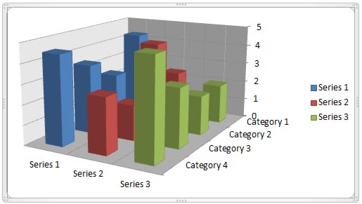
The Z axis is the depth axis that some 3D charts contain. Sometimes, the Z axis is also called the series axis. Let us be clear about the fact that not all 3D charts contain a Z axis. In fact, some 3D chart variants use the third dimension even if they do not need a Z axis! They do so just because some people wrongly believe that 3D is so cool.
To learn more, choose your version of PowerPoint. If we do not have a tutorial for your version of PowerPoint, explore the version closest to the one you use.
Z Axis in PowerPoint Charts: Pros and Cons
Tutorial Code: 10 11 01
Previous: 10 10 01 Picture Fills for Chart Series in PowerPoint
Next: 10 11 02 Make 3D Columns Semi-Transparent for Charts in PowerPoint
Filed Under:
Number
Tagged as: 10-11, 3D Charts, Charts and Graphs, PowerPoint Tutorials
Comments Off on 3D Charts: Z Axis in PowerPoint Charts: Pros and Cons
Microsoft and the Office logo are trademarks or registered trademarks of Microsoft Corporation in the United States and/or other countries.