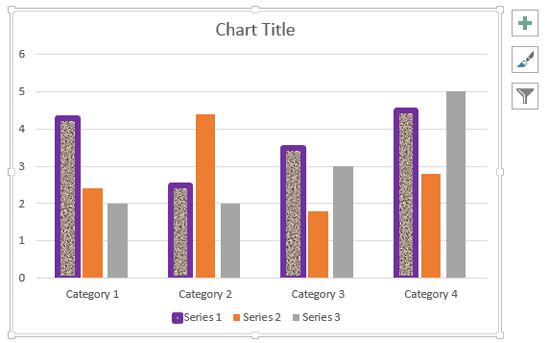
The default fill and border (line) that PowerPoint applies to chart elements are perfectly adequate. If you want something different, play with various Chart Styles available. While this works great most of the time, there will be occasions when you may want to use a particular color for any of your data series that’s not part of the Theme palette in your presentation. In times like these, you can change the fill and border of chart elements manually using the techniques explained.
To learn more, choose your version of PowerPoint. If we do not have a tutorial for your version of PowerPoint, explore the version closest to the one you use.
Microsoft Windows:
Changing Fill and Border of Charts in PowerPoint 2013
Changing Fill and Border of Charts in PowerPoint 2010
Changing Fill and Border of Charts in PowerPoint 2007
Changing Fills and Border of Charts in PowerPoint 2002 and 2003
Apple Mac:
Changing Fill and Border of Charts in PowerPoint 2011
Tutorial Code: 10 01 05
Previous: 10 01 04 Changing Chart Types in PowerPoint
Next: 10 01 06 Quick Layouts for Charts in PowerPoint