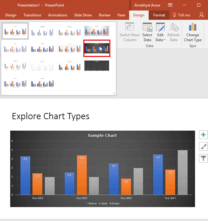
Making a chart look different translates to so much involvement. That’s because each chart has almost 10 or more elements that contribute to its appearance. Of course, you can format all these 10 elements individually, and end up spending some quality time exploring nuances that end up with some amazing and distinctive results. But what if you want the same format applied to another chart? The same format will be difficult to apply to any other chart because you will have to remember all the attributes you applied in the first one—not to speak about the time it will take to create a coordinated chart.
To learn more, choose your version of PowerPoint. If we do not have a tutorial for your version of PowerPoint, explore the version closest to the one you use.
Microsoft Windows:
Chart Styles in PowerPoint 2016
Chart Styles in PowerPoint 2013
Chart Styles in PowerPoint 2010
Chart Styles in PowerPoint 2007
Apple Mac:
Chart Styles in PowerPoint 2011

Tutorial Code: 10 01 02
Previous: 10 01 01 Inserting Charts in PowerPoint
Next: 10 01 03 Chart Elements in PowerPoint
