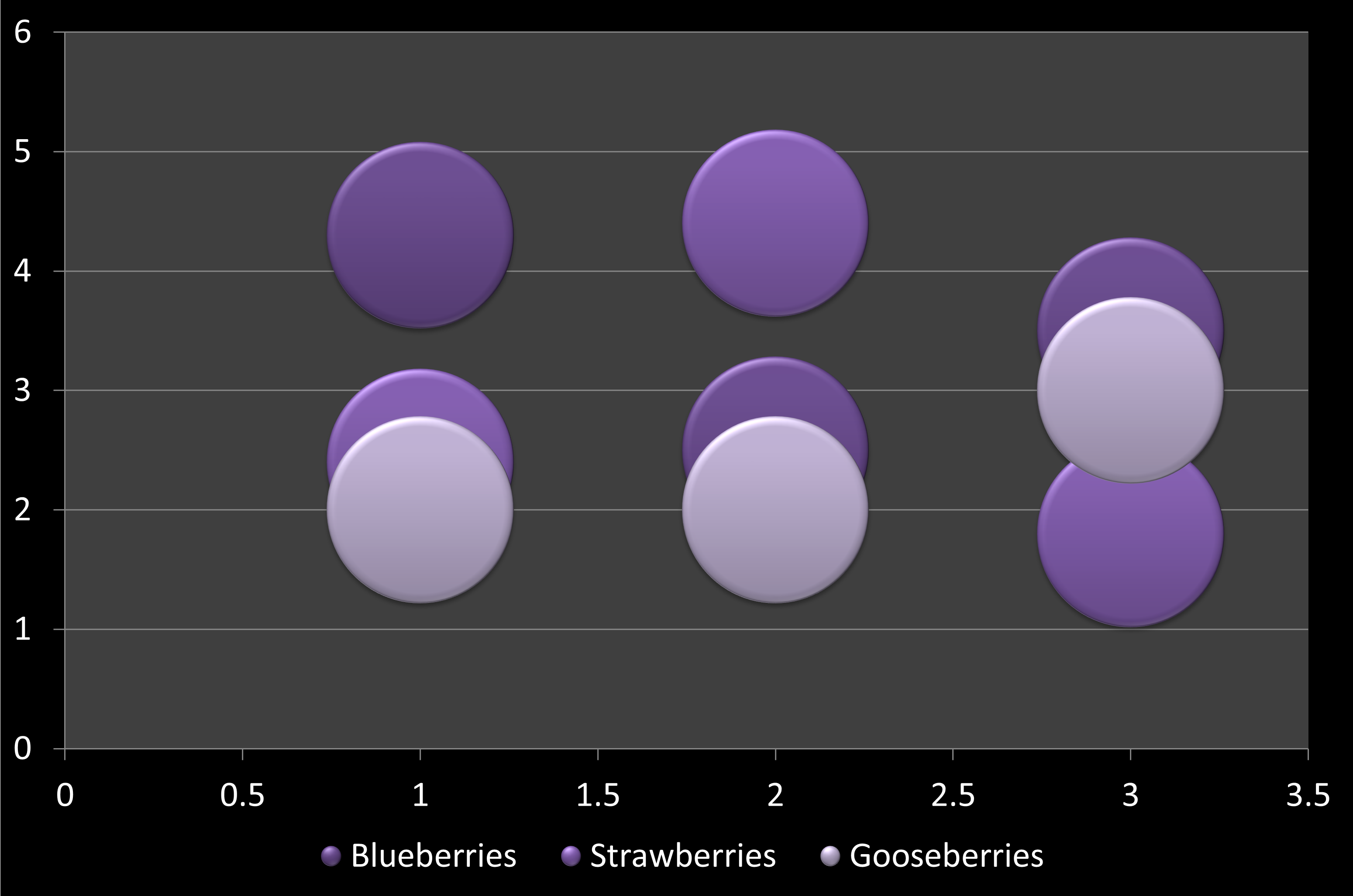
In a bubble chart, data that is arranged in columns on a worksheet can be plotted, so that X values are listed in the first column. The corresponding Y values and bubble size values are listed in adjacent columns of the data. This data can can be collectively plotted in a bubble chart.
To learn more, choose your version of PowerPoint. If we do not have a tutorial for your version of PowerPoint, explore the version closest to the one you use.
All versions
Bubble Chart Type in PowerPoint
Tutorial Code: 10 14 11
Previous: 10 14 10 Doughnut (Donut) Charts in PowerPoint
Next: 10 14 12 Radar Charts in PowerPoint