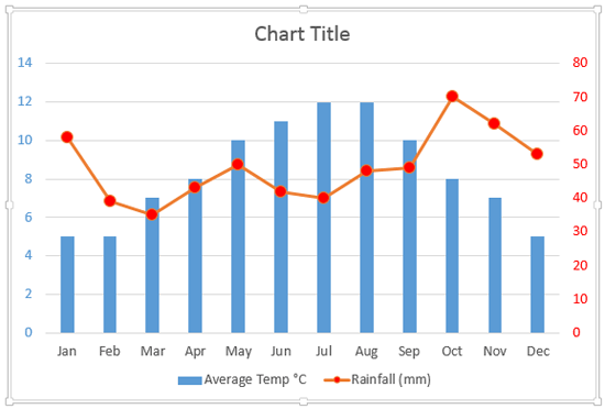
Sometimes your data type may require a second axis. The sample data that we took for this tutorial pertains to the average temperature and rainfall in London across the 12 calendar months of a year.
To learn more, choose your version of PowerPoint. If we do not have a tutorial for your version of PowerPoint, explore the version closest to the one you use.
Microsoft Windows
Add Secondary Value Axis to Charts in PowerPoint 2013
Apple Mac
Add Secondary Value Axis to Charts in PowerPoint 2011
Tutorial Code: 10 08 08
Previous: 10 08 07 Reposition and Hide Axis Labels in PowerPoint
Next: 10 08 09 Crossed Axes for Charts in PowerPoint