 June 30th, 2021
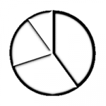
PowerPoint Chart Types: Pie Charts in PowerPoint
![]()
See Also:
PowerPoint and Presenting Notes
PowerPoint and Presenting Glossary
 June 16th, 2021
 Themes Basics: Display Theme Name in PowerPoint
Both PowerPoint 2010 and PowerPoint 2007 show the name of the active Theme for a presentation within the Status Bar. We look for a similar option within the PowerPoint 2013 interface. Note that there is no Theme name displayed on the Status Bar. However you can reinstate the Theme name. To learn more, choose your version of ...
 Vivek Thangaswamy
Vivek Thangaswamy is a Software Solution developer and technical author based in Chennai, India. He specializes in Microsoft enterprise application architectures and server-based product integrations. Vivek is a Microsoft MVP, and he completed his Bachelor of Technology degree in Information Technology and is currently pursuing an MBA in Finance. Here’s a list of links on ...
 Sune Høj Kodahl
Sune Høj Kodahl is the CEO and co-founder of Ampler, a Copenhagen-based SaaS company he co-founded with Kristian Nygaard Johansen. Both started their careers as consultants at Bain, and when they left, they found themselves missing the productivity toolbox the firm had built for Microsoft Office. That gap became the founding idea for Ampler. What ...
Microsoft and the Office logo are trademarks or registered trademarks of Microsoft Corporation in the United States and/or other countries.